by Callum Martin
Finally! In just over a month, the World Cup will return to capture the world’s imagination, albeit in an oddly timed four weeks through late November and early December. The global fanaticism with the beautiful game seems to have permeated almost every part of life. From activism and breaking barriers to fashion and music, football seems to be a unique vehicle for changes in societal norms and cultural views.
A major aspect that has seen its importance within football grow almost exponentially in recent years is the fashion of football.
From the burgeoning demand for vintage kits to teams having off-field fashion providers, the lines between fashion and sportswear have become so increasingly blurred that you could argue that they are now one and the same. Every kit release is now not only judged on how well it encapsulates a team’s colours, personality and identity, but also how aesthetically pleasing it would look on both the pitch and on the streets.
So, with this world cup in a month, there’s been 32 countries that have released 66 different kits, all hard at work to be the coolest in the sweltering heat of the Qatari desert. But who’s done the best? And who has flopped before they’ve even touched a football? Let’s take a quick look through the best and worst kits to hit the field this winter.
Looking at the spread of kit provider, there’s already some interesting trends. With 32 countries in the competition, 26 of them are donning kits made by one of football’s “big 3”: Nike, Adidas, and Puma. This leaves a lot of work to these three to try and come up with stylish and unique kits for all the countries they’re representing, and only Adidas seem to have been up to that challenge.
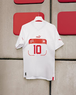
Puma, usually a great international kit provider, has fallen short of the mark this time round. Producing kits for six nations for the tournament, they’ve been uncharacteristically unremarkable in their designs. Every nation has a white kit, although in their defence you would expect a white kit from all countries Puma represents, and every away kit has a weird box on the front where the player’s number would sit. It’s an interesting feature, but to do it on every kit? It’s just unoriginal and the strips look especially odd if you were to get one without a player’s number. Their best showing is for Morocco’s kits, and even then, they’re a bit, well, bland? Nothing to write home about here.
Nike, on the other hand, have been spectacularly and wildly inconsistent with their national strips. Their 13 countries have been given kits that vary from the vintage vogue to the cataclysmically catastrophic. There’s not one country that gets away with two good kits. The closest are probably Portugal, who have a nice cream away kit with references to the Portuguese flag, but a home kit that tries so hard to be modern and cool that it ends up looking clunky and odd, or home nation Qatar, whose kits are just quite simply designed and therefore end up looking quite clean.
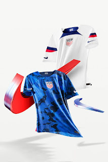
Most countries with Nike as a kit provider have at least one kit that looks like a training top rather than a true national team kit. If you need any convincing, look no further than USA’s tie-dye away kit or Brazil’s jaguar away strip. Both quite nice in isolation, but they’re not worthy of representing either country’s team on the global stage. Oh yeah and Canada’s home and away kits are so boring and basic, I think that I had better Nike kits when I was playing under 12’s.
All this has left the door open for Adidas to work their magic. 7 countries have been blessed. The worst you can say about any of the kits is that some play it a bit safe, like Spain’s blocked red home strip, but even then, it is still an objectively nice kit. They haven’t missed a beat anywhere. Every nation has at least one kit that can be argued to be one of the tournaments best. It’s a truly impressive feat.
They’ve let the designs do the talking, going as far as to take the adidas name off the brand logo, just leaving the iconic three stripes. They’ve laid down the gauntlet for the ages for an instantly iconic kit capsule for an international sporting event.
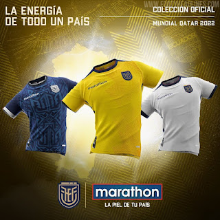
Other smaller brands have also made their make, with both Ecuador and Denmark turning to national companies to provide their kits. Marathon Sports have done a stellar job with Ecuador’s shirts, embracing the vibrancy of the country’s flag for the home kit, and going for a gorgeous geometric, blue, two-tone piece for the away strip, which is one of the stand outs from the whole tournament.
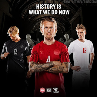
Hummel, on the other hand, have used the global platform of the World Cup to speak out and make a statement about the ethics of hosting the world cup in Qatar. Monochromatic kits in red, white and black for the home, away, and third strip respectively have had the logos of Hummel and the DBU deliberately toned down. This is to make them almost invisible as a wish from both the company and the Danish FA to show that they aren’t supporting the host nation of Qatar due to their alleged human rights abuses, including the exploitation of migrant in the construction of many of the stadiums built for a tournament that has been mired in controversy ever since Qatar won the bid in 2010. In an Instagram post debuting the all black third kits, Hummel stated that this was to represent “the colour of mourning” and the “perfect” colour to speak out against the ‘sport-washing’ which seems to be becoming more and more associated with continued middle eastern investment in sports such as football.
Whatever your view on the ethicality of the tournament, it certainly is a strong statement and stance from the Danes.
Worst Kits
Okay, so before we get onto to the best kits, it’s time to talk about some of the less honourable mentions and unfortunately for the American company, most of the worst kits from the world cup this year come courtesy of sports giants Nike.
We’ve already mentioned their wild inconsistency with kits this winter and here’s where we get to the bottom of the barrel.
Nike’s worst crimes come from their kits to Australia and the Netherlands. It’s a heavy competition between the two for the worst in the whole tournament. Both home kits have been given their base colours of yellow and orange respectively a sunburst look to give them an almost shimmer effect. Both end up looking like shiny colourful rubbish bags.
They’re DREADFUL.
The true tragedy of this all is that Nike CAN make good national kits. They just did at last summer’s women’s Euro’s. But for this summer, I’d rather be repping a Lionesses kit than splashing out on the new Three Lions home kit. Nike can and should be doing better.
So, sorry to the Aussie’s but your kits suck.
Best Kits
And now onto the best! There’s such a wide selection of equally brilliant home and away strips that choosing your favourite comes down to a matter of personal opinion.
I will happily sit and defend the Argentina home kit and the England away kit as my favourite home and away strip.
Argentina’s taken it back to basics and stripped it back to their iconic Albiceleste best. Sky-blue and white strips, with contrasting black details. It may be simple, but this is a case of less is more and it’s so clean. A kit worthy of being the one that Leo Messi finally captures world cup glory in? We are yet to see.
England’s away also hits on that classic nail on the head, with a 1990 inspired red and powder blue piece that is marvellous. I may be a little biased on this one, but the bright colours with the new collar and little detailed touches make it a shirt that will look good on AND off the pitch. Honestly, maybe more off the pitch. With England one of the favourites to win the whole tournament, their away kit is one of my favourites full stop.
But in terms of best home AND away kit, I think that that honour lies with the Germans. A quick shout out to the Japanese and Welsh for having stellar kits across the board but die Deutsche take the cake.
Adidas, as expected perhaps from the German company, have SPOILT die Mannschaft with beautiful kits over the years and this time round is no different. The home strip is regal with golden detailing and an Ajax-esque broad black stripe down the chest stamping the kits with all the authority of the Brandenburg Gate. So simple, yet so so good looking, it’s efficient in its elegance. Then we get onto the away kit. Brooding red and black, it’s menacing, stylish, and will be sure to put the same fear into any team that the German sides of old used to.
They might occasionally be known by the moniker of Turniermannschaft (Tournament Team), implying that they only turn up for tournaments and when the games really matter, but with these kits, Germany have turned up before the tournament and should surely be the Sheikhs of style in the Qatari desert.

